
kc kombucha
RE-BRAND
+
ART DIRECTION
+
LOGO DESIGN
+
PACKAGING
+
KOMBUCHA
+
STRATEGY
+
RE-BRAND + ART DIRECTION + LOGO DESIGN + PACKAGING + KOMBUCHA + STRATEGY +
SLOW AND STEADY
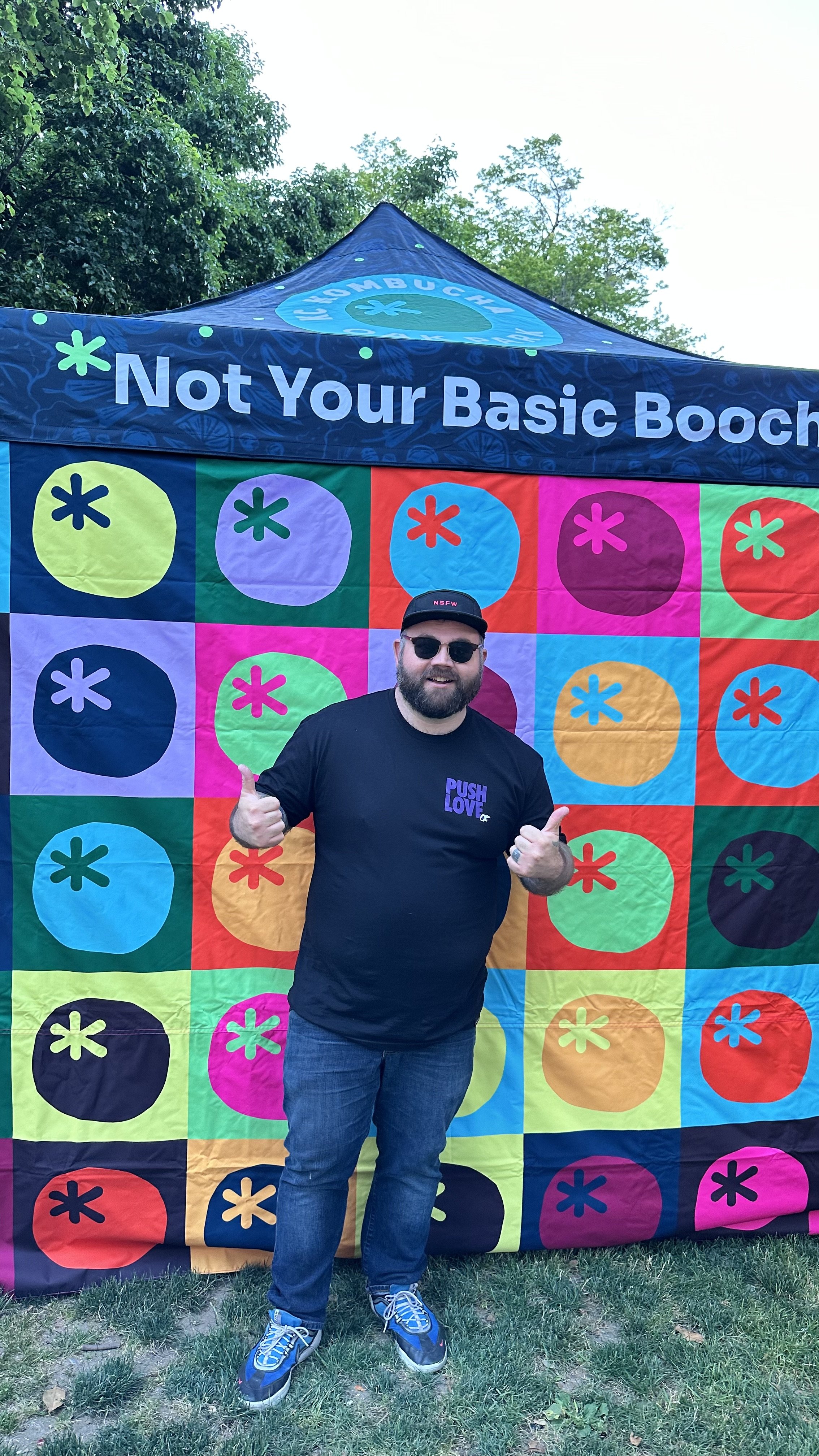
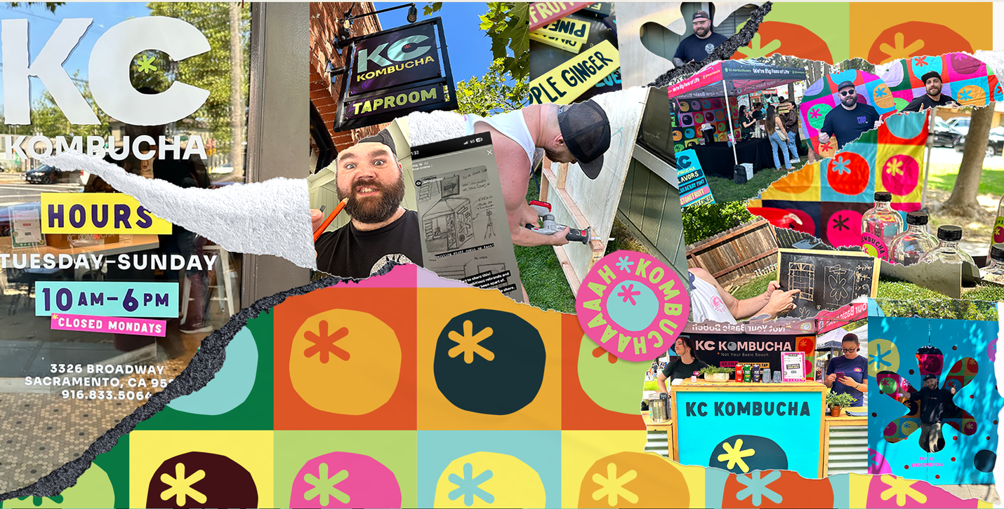
KC Kombucha - Sacramento’s first Kombucha Taproom
A female-owned and operated kombucha taproom in Oak Park, Sacramento, KC Kombucha isn’t just about great drinks—it’s about uplifting the community. They champion female-owned small businesses while crafting delicious, approachable kombucha in a one-of-a-kind taproom experience.
KC Kombucha has been with me from the jump, starting with pop-ups throughout Sacramento. When Courtney first reached out, she needed labels for refillable glass bottles. Over the years, this evolved into a series of vibrant can designs, each serving as a universal template for any flavor chosen in-store.
The journey toward a full rebrand was a gradual one, but every step—especially the can designs—became a meaningful milestone in KC’s visual evolution. Watching the brand take shape over time was a rewarding process, and the end result speaks for itself.
COLLABORATORS
Tristan Rumery (AWFULLY GREAT CO.)


Approached with Strategy
When it came time for a full refresh, my collaborator (Tristan Rumery) and I worked closely with Courtney and her team to refine KC Kombucha’s brand identity. In a market overflowing with hard kombucha, KC stands apart by focusing on health, sustainability, and community impact. Our goal was to create a visual identity that embodied these values while maintaining a fun, approachable energy.
To achieve this, we expanded the brand’s color palette to reflect seasonal brews and crafted playful slogans like "Not Your Basic Booch" and "Brew a Better Biome." These elements became integral to KC’s social media and marketing, strengthening their voice and creating an identity that customers instantly connect with.


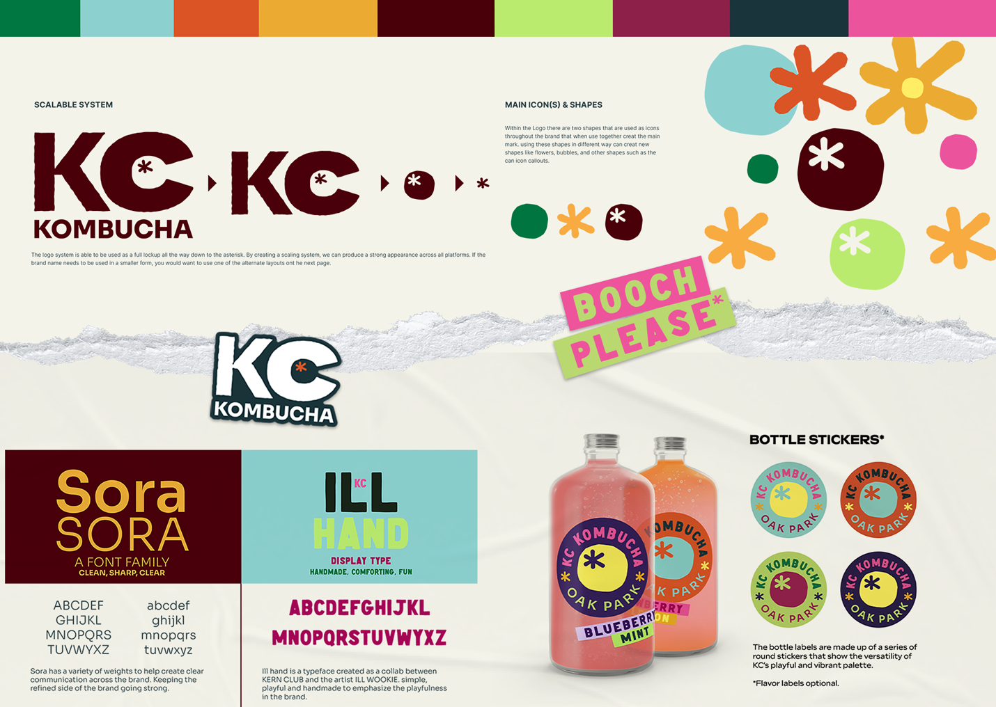
Scalability & Adaptability
KC Kombucha’s new branding was built with flexibility in mind. The logo was designed to break down into fruit and natural shapes, allowing for endless variations across products, signage, and merchandise. Icons on cans provide clear product details, while sticker-style assets bring a fun, cohesive touch to labels and promotional materials.
The brand’s adaptability means KC Kombucha can grow without losing its essence. Whether it’s expanding their product line, launching new flavors, or stepping into new markets, their identity is built to evolve with them.

Conclusion: A Brand That Grows With Its Community
At its core, KC Kombucha isn’t just about brewing drinks—it’s about fostering a vibrant, inclusive space where people connect. Through thoughtful design and strategic branding, we helped bring their vision to life in a way that not only reflects their values but sets them up for continued success. As they grow, their brand will remain as dynamic, welcoming, and fresh as the kombucha they pour.
“We had the pleasure of collaborating with David & Tristan for a transformative branding experience at our Sacramento-based kombucha company. David Angstead and his team didn't just create a logo; they took us on a journey to truly understand who we were as a company and what we stood for. Through an insightful workshop, David sat down with key members of our team, enabling us to nail down our vision and values, and our key customers. From there, they crafted a brand profile that perfectly encapsulated our essence. The resulting logo and color pallete was a beautiful, fun design flowing with profound meaning. The close collaboration throughout the process made it feel like a true partnership, and the support in rolling out our new brand was invaluable. Their work has not only elevated our visual identity but also our entire brand's essence. We couldn't be happier with the results.”
— Courtney Edwards, Owner of KC Kombucha